glasscn-ui - Glassmorphic Component Library based on shadcn/ui
Library
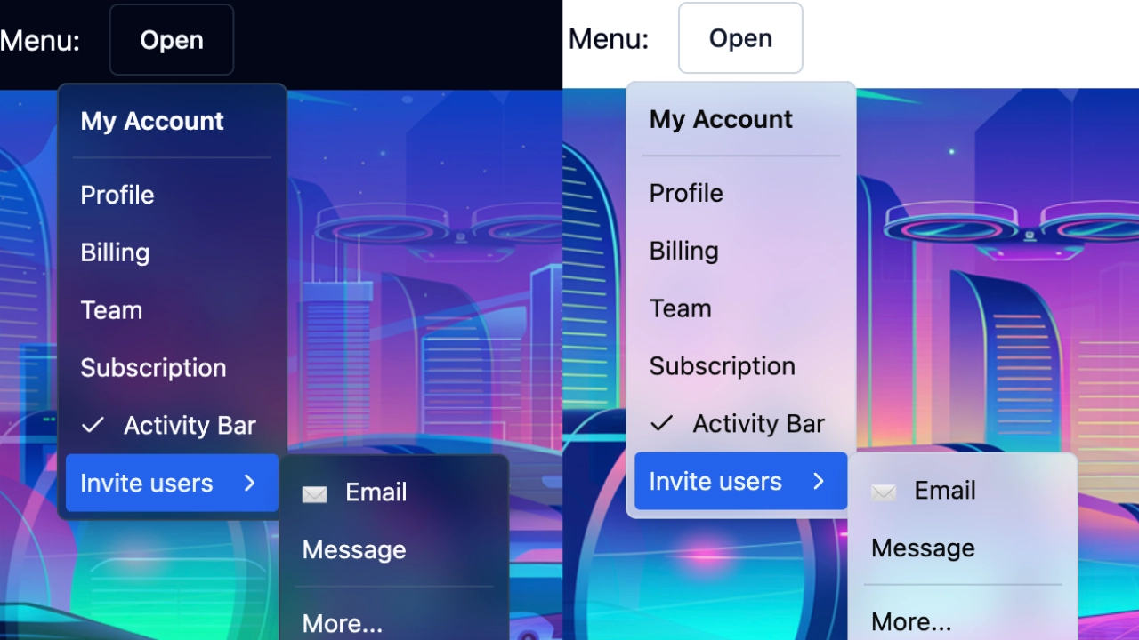
Themable shadcn/ui component library with glassmorphism variants, and extra components such as CircularProgress.
Features
This package includes most of the shadcn/ui components bundled in a single component library, with the following changes:
- Glassmorphic variants for components with solid surfaces (cards, buttons, dialogs, menus, etc.), with adjustable blur.
- Improved color options and management: Additional color aliases and easier color switching. More consistent color usage, specially with gray and primary/accent colors.
- New components like CircularProgress, ComboBox, DotIndicator, and HeadingTitle.
- Improved button styles and variants, with more colors.
- Enhanced toast notifications.