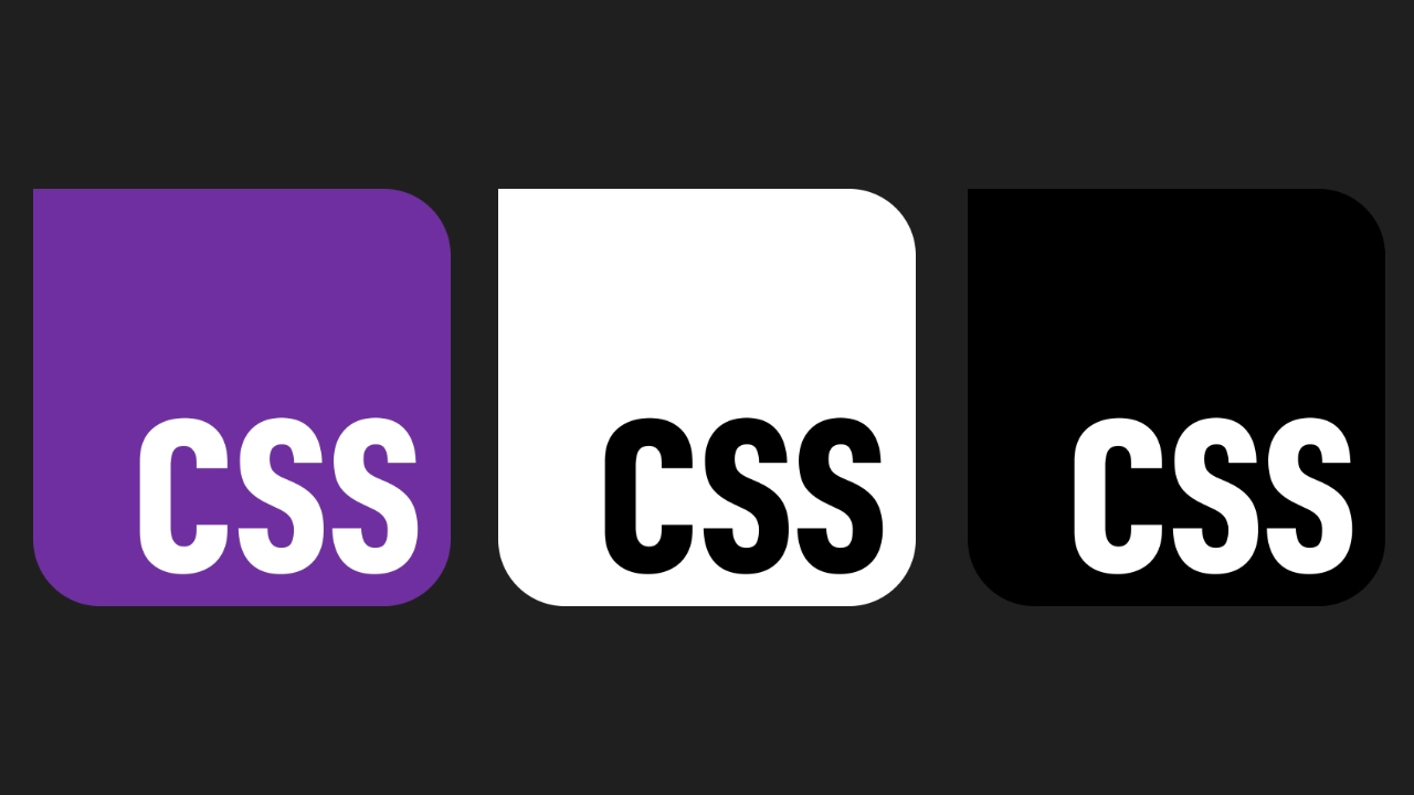
New CSS Logo for a new CSS era
In August 2024, I saw on social media that the CSS-Next community group (a part of the W3C) was asking the community to propose a new logo for CSS. After giving it some thought, I came up with a few ideas.
I then decided to give it a shot and submitted my proposal on the GitHub thread, including multiple variants for the community to choose their favorite.
A month later, while waiting for my flight back to Berlin at the airport, I saw that the CSS-Next group had selected my proposal as the final version! It was also the most voted option by the community.
I was thrilled and quickly accepted the task of preparing the final version in various formats with the help of Adam Argyle from Google. I remember opening my laptop during the flight to iterate on the design, and polishing it for a few hours.
After that we iterated extensively, creating many revisions and variants on Figma, incorporating community feedback from GitHub, Mastodon, Bluesky, and Twitter (now X). Eventually after a couple of months, we finalized the logo, which you can see at the end of this post.
Design Features
The design incorporates several nods to CSS and web design:
- Subtle rounded corners: The logo resembles a tooltip or popup element, referencing challenges CSS developers used to face with styling such elements. Thanks to modern specs like Anchor Positioning and the HTML Popover API, such tasks are now much easier. So it represents the evolution of CSS in web design.
- Modern CSS features: The HTML/CSS version of the logo uses modern
features like
@containerqueries. - Familiar web colors: The logo prominently features well-known web colors such as rebeccapurple (final version) and hotpink (original proposal).
- Timeless and accessible: The design is versatile and works well across different formats and media. CSS is not a brand, but a technology and I also wanted to represent that through the simplicity of the design.
- Harmonizes with the other logos: The design is recognizable and works well with the logos of the other technologies of the Web like JS and WebAssembly.
Design Criteria
The logo submission had to meet the following requirements:
- Works well in monochrome (black and white).
- Is functional with and without a version number.
- Maintains legibility and recognizability at small and large sizes.
- Is identifiable by color and shape, even at very small text sizes (e.g., 12px).
- Can be represented in both SVG and CSS-only formats.
- Harmonizes with existing community logos (e.g., JS, WebAssembly) and other brands (e.g., TypeScript).

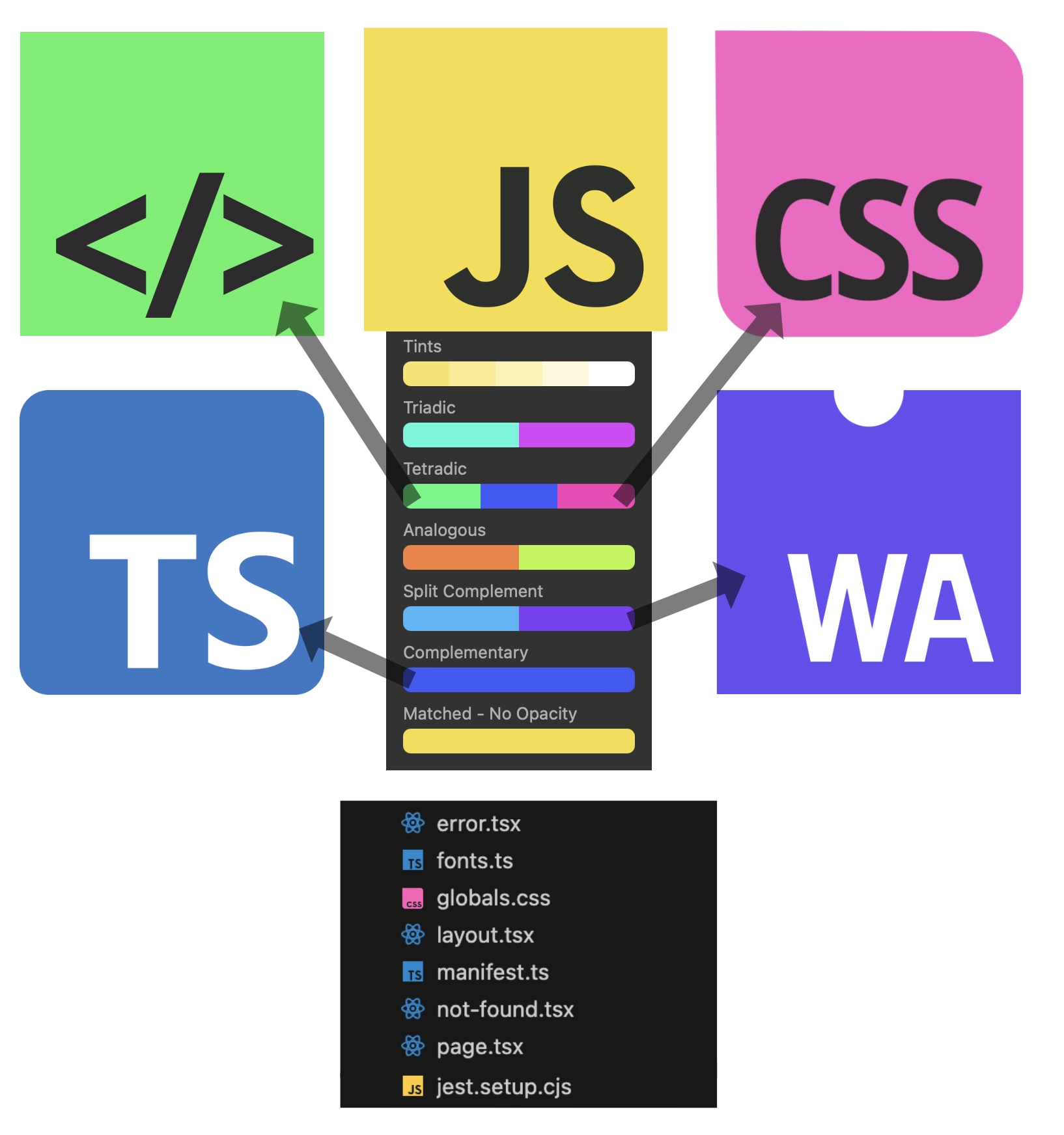
Infographic of the original proposal using hotpink. I chose the pink color as part of the JS logo’s tetradic color scheme. Pink is also often associated with makeup 💅, and CSS is often considered the “makeup” of the web!
As you can see in my original CSS logo proposal, I also played with the idea of a new logo for HTML, with a color that
would harmonize with the rest. Maybe it’s also time for a new logo for HTML?
Final Version
In the final version, we opted to use an open-source font:
DINish Preview Condensed and also proposed a color change to rebeccapurple.
The DINish font is a modern take on the classic DIN 1451 font, a font you can see in many street and Autobahn signs in Germany. A wink to the place that has adopted me for so many years 🙂
The Working Group preferred rebeccapurple over the original hotpink, a meaningful choice tied to a beautiful but also sad story.
This shade of purple honors Rebecca Alison Meyer, the daughter of Eric Meyer, a pioneer in CSS and web development.
Rebecca’s love for purple and her vibrant spirit inspired the web community to memorialize her in 2014 by officially
naming #663399 as “rebeccapurple” in CSS. Initially proposed as “beccapurple,” Eric shared that Rebecca, upon turning
six, preferred to be called “Rebecca” instead of “Becca,” leading to the name “rebeccapurple.” It’s a symbol of love,
loss, and the unbreakable ties that bind us, even across the vastness of the web.
Fast forward to today, the new CSS logo carries this legacy forward honoring her 10 years later. It’s more than just a design refresh, it’s a beacon of community, empathy, and humanity within tech. While celebrating the progress of CSS and the tech community, we also honor the stories that shape us.
After a popular vote (with more than 460
votes in favor), the community chose rebeccapurple as the final color together with the final design.

Acknowledgments
Special thanks to Adam Argyle for assisting with the iterations, the HTML/CSS version, and community feedback.
I also want to thank everyone who contributed their ideas and feedback, and a big thank you to the CSS-Next group for being so welcoming and choosing my proposal as the final candidate!
You can view and download the final version in various formats (images, SVG, CSS, etc.) on GitHub.